Company
Brand
The Wonmor mark, how to use it, the colours and type behind it, the brand film, and the files to download.
Updated
The mark
The Wonmor mark tells one short story. It starts as a single diamond. The diamond is cut into a V. Then the V splits in two, and the two V’s standing side by side become a W.
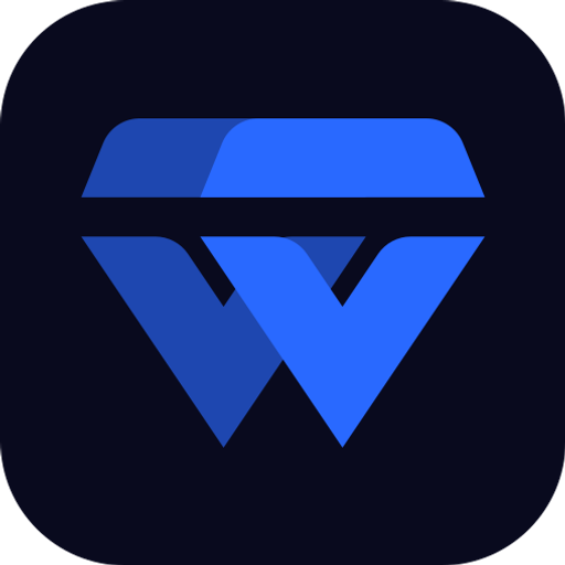
The finished mark is those two V’s. Each V is built from the same two parts: a flat top bar (the crown) and a chevron below it. The left V sits slightly behind, at 65% opacity; the right V is solid. Keeping the left one lighter is what lets the mark read both as two V’s and as one W.
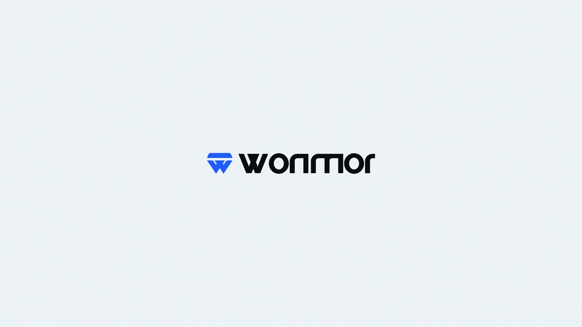
Because the mark is the letter w, the full lockup is the mark followed by onmor. Never set the word “wonmor” next to the mark: that spells the W twice.
Lockups
The wordmark “onmor” is not typed in a font. It is drawn from the same geometry as the mark: the top of the mark lines up with the top of the lowercase letters, and the point of the V sits on their baseline. There are two lockups:
| Lockup | Mark | Wordmark | Use on |
|---|---|---|---|
| On light | Wonmor Blue | Ink | Paper, white and light photographs |
| On dark | Wonmor Blue | White | Ink, black and dark photographs |
Use the mark alone where space is tight, such as app icons, avatars and favicons. Use the lockup where the name needs to be read.
Colours
| Name | Hex | Role |
|---|---|---|
| Wonmor Blue | #2969FF |
The mark, always |
| Ink | #090A1E |
Wordmark on light backgrounds; dark icon background |
| White | #FFFFFF |
Wordmark on dark backgrounds; mark on Wonmor Blue |
| Paper | #FAF9F5 |
The warm page colour of wonmor.io and of our social cards |
The brand colours are for the logo. The website itself uses a quiet scale of warm greys around Paper and Ink, so the mark is the only strongly coloured thing on most pages.
Typography
The site is set in four open-source typefaces, all licensed under the SIL Open Font License and served from wonmor.io:
| Use | Typeface |
|---|---|
| Interface and headings, Latin | Hanken Grotesk |
| Interface and headings, Cyrillic | Onest |
| Long reading text and statements | Source Serif 4 |
| Code and data | JetBrains Mono |
None of them is used for the wordmark, which is always the supplied drawing.
Clear space and minimum size
The figures in this section are guidance, not hard rules; use judgement for unusual formats.
- Clear space. Keep an empty margin around the mark or lockup at least as tall as the crown, the top bar of one V. That is roughly a quarter of the mark’s height. Nothing else, including text, edges and other logos, should enter that margin.
- Minimum size, screen. Mark: 16 px tall, which is the size of the favicon. Lockup: 120 px wide, so the letters of “onmor” stay clearly separate.
- Minimum size, print. Mark: 5 mm tall. Lockup: 25 mm wide.
- Icons. For app icons and avatars use the supplied rounded-square icons; they already include the right padding.
Do and don’t
| Do | Don’t |
|---|---|
| Use the supplied files as they are | Redraw the mark or retype the wordmark in any font |
| Put the blue mark on light or dark backgrounds with clear contrast | Recolour the two V’s in different colours, or use gradients |
| Use the white mark on Wonmor Blue or on dark photographs | Add shadows, glows, outlines, bevels or 3D effects to the static mark |
| Keep the left V lighter than the right | Merge the two V’s into one solid shape, or swap their order |
| Scale the mark proportionally | Stretch, squeeze, rotate or crop it |
| Leave clear space around it | Place it on busy patterns where it stops being legible |
| Write “Wonmor” next to the mark only when the lockup is not used | Combine the mark with “wonmor” to make “wwonmor” |
Naming
- Wonmor is written with a capital W in running text. It is a brand, so do not add “Inc.”, “LLC” or similar.
- dtwin is always lowercase, even at the start of a sentence or in a headline.
- Product names keep their own spelling: bitg and operobot in lowercase, TeleTwin with two capitals.
- Say “dtwin, built and supported by Wonmor” when you need to describe the relationship. dtwin is a product ecosystem; Wonmor is the brand behind it.
The brand film
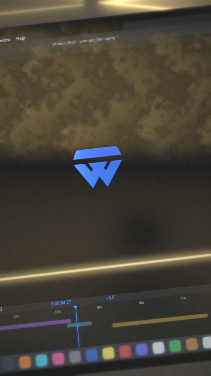
The brand film is a 19.4-second animation of the mark’s story: the diamond, the cut, the split into two V’s and the letters of the lockup arriving. It is rendered from code, from the same geometry files as the logo. There are two versions: 16:9 at 1920×1080 for screens and presentations, and a vertical 9:16 version for phones and stories.
You may show the film in coverage of Wonmor or its products, as long as you do not edit, recolour or re-time it, or add other branding to it.
Downloads
The files below include the mark in blue and white (SVG), the icons on dark, blue and light backgrounds (SVG, plus PNG at 192 and 512 px), the two lockups (SVG) and both versions of the brand film (MP4).
They are for articles, reviews, talks and links that refer to Wonmor or the dtwin products. They do not grant a licence to use the brand in your own product name or to suggest a partnership. For anything not covered here, ask on Telegram: t.me/xnosir.
-
 Lockup · lightSVG
-
 Lockup · darkSVG
-
 Mark · blueSVG
-
 Mark · whiteSVG
-
 App icon · blueSVG
-
 App icon · darkSVG
-
 App icon · lightSVG
-
 App icon · PNG 512PNG
Colours
- Wonmor Blue
#2969FF - Ink
#090A1E - White
#FFFFFF